code

share


In the previous Section we saw how a nonlinear model built from units of a single universal approximator can be made to tightly approximate any perfect dataset if we increase its capacity sufficiently and tune the model's parameters properly by minimizing an appropriate cost function. In this Section we will investigate how universal approximation carries over to the case of real data, i.e., data that is finite in size and potentially noisy. We will then learn about a new measurement tool, called validation error, that will allow us to effectively employ universal approximators with real data.
Here we explore the use of universal approximators in representing real data using two simple examples: a regression and two-class classification dataset. The problems we encounter with these two simple examples mirror those we face in general when employing universal approximator-based models to real data, regardless of problem type.
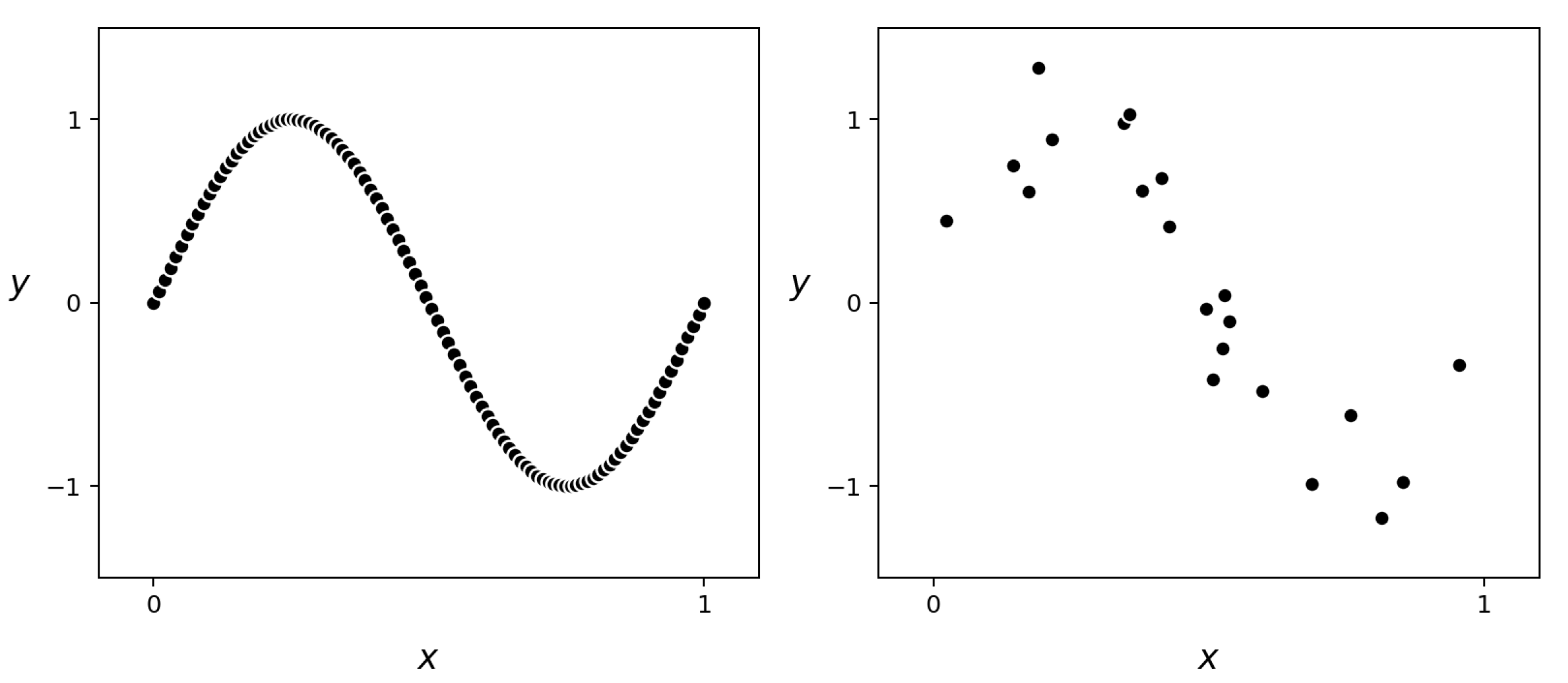
In this example we illustrate the use of universal approximators on a real regression dataset that is based on the near-perfect sinusoidal data presented in Example 11.5. To simulate a real version of this dataset we randomly selected $P = 21$ of its points and added a small amount of random noise to the output (i.e., $y$ component) of each point, as illustrated in Figure 11.18.
In the animation below we illustrate the fully tuned nonlinear fit of a model employing $1$ through $20$ polynomial units (left panel), single-layer $\text{tanh}$ neural network (middle panel), and stump units (right panel) to this data. Notice how, with each of the universal approximators, all three models underfit the data when using only $B = 1$ unit in each case. This underfitting of the data is a direct consequence of using low capacity models which produce fits that are not complex enough for the underlying data they are aiming to approximate. Also notice how each model improves as we increase $B$, but only up to a certain point after which each tuned model becomes far too complex and starts to look rather wild, and very much unlike the sinusoidal phenomenon that originally generated the data. This is especially visible in the polynomial and neural network cases, where by the time we reach $B = 20$ units both models are extremely oscillatory and far too complex. Such overfitting models while representing the current data well, will clearly make for poor predictors of future data generated by the same process.
Below we animate several of the polynomial-based models shown above, along with the corresponding Least Squares cost value each attains, i.e., the model's training error. In adding more polynomial units we turn up the capacity of our model and, optimizing each model to completion, the resulting tuned models achieve lower and lower training error. Doing this clearly decreases the cost function value over the training set (just as with perfect or near-perfect data). However the resulting fit provided by each fully tuned model (after a certain point) becomes far too complex and starts to get worse in terms of how it represents the general regression phenomenon. As a measurement tool the training error only tells us how well a tuned model fits the training data, but fails to tell us when our tuned model becomes too complex.
In this example we illustrate the application of universal approximator-based models on a real two-class classification dataset that is based on the near-perfect dataset presented in Example 11.6. Here we simulated a realistic version of this data by randomly selecting $P = 99$ of its points, and adding a small amount of classification noise by flipping the labels of $5$ of those points, as shown in Figure 11.18.
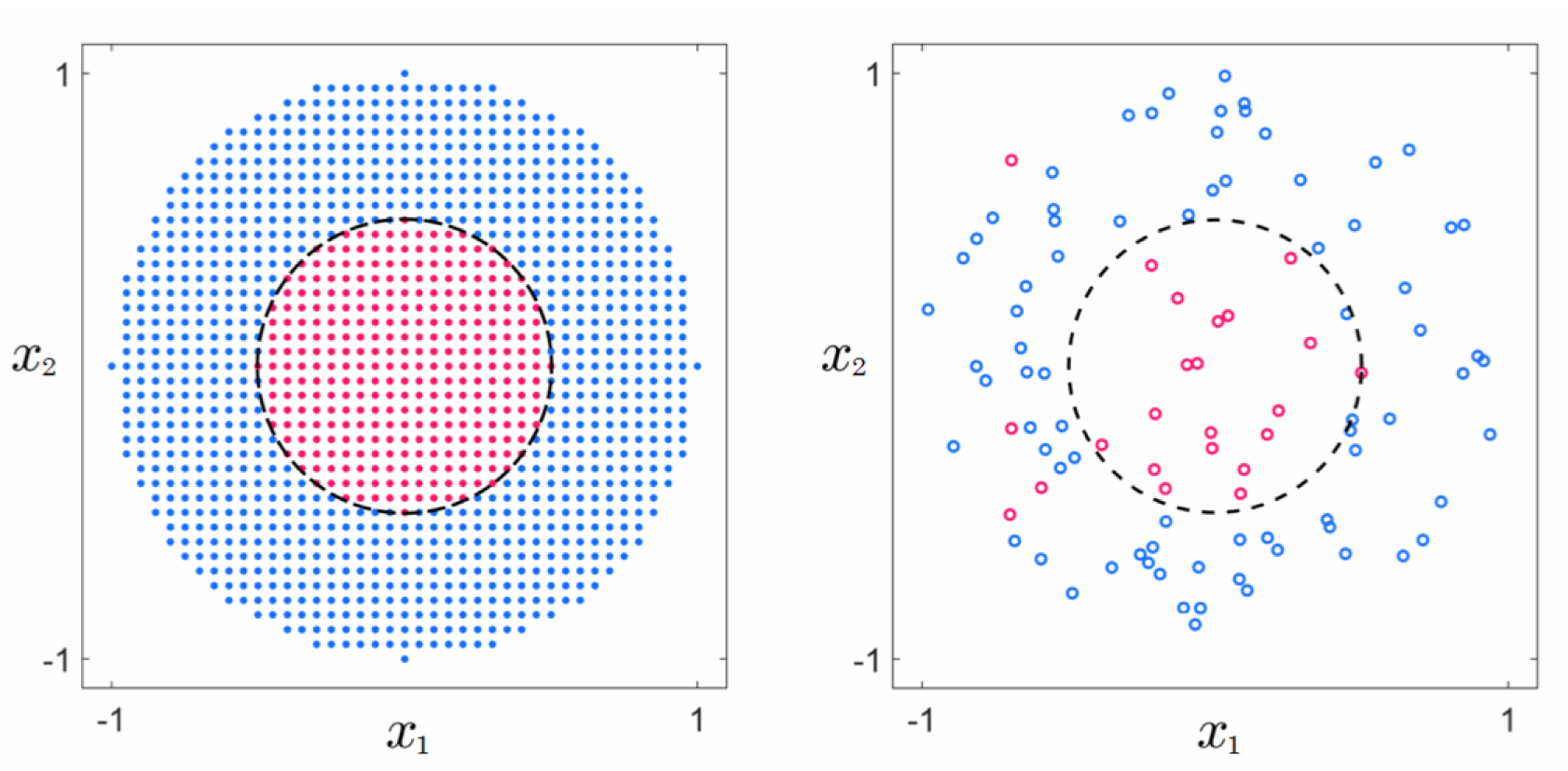
In Figure 11.18 we show the nonlinear decision boundaries provided by fully tuned models employing $B = 1$ through $B = 20$ polynomial units (top row), $B = 1$ through $B = 9$ single-layer $\text{tanh}$ neural network units (middle row), and $B = 1$ through $B = 17$ stump units (bottom row), respectively. At the start all three tuned models are not complex enough and thus underfit the data, providing a classification that in all instances simply classifies the entire space as belonging to the blue class (label values $y = -1$). After that and up to a certain point the decision boundary provided by each model improves as more units are added, with $B = 5$ polynomial units, $B = 3$ $\text{tanh}$ units, and $B = 5$ stump units providing reasonable approximations to the desired circular decision boundary. However soon after we reach these numbers of units each tuned model becomes too complex and overfits the training data, with the decision boundary of each drifting away from the circular boundary centered at the origin that would properly predict the labels of future data generated by the same underlying phenomenon. As with regression in Example 11.7, both underfitting and overfitting problems occur in the classification case as well, regardless of the sort of universal approximator used.
In the animation below we plot several of the neural network-based models shown above, along with the corresponding two-class softmax cost value each attains. As expected, increasing model capacity by adding more $\text{tanh}$ units always (upon tuning the parameters of each model by complete minimization) decreases the cost function value (just as with perfect or near-perfect data). However the resulting classification, after a certain point, actually gets worse in terms of how it (the learned decision boundary) represents the general classification phenomenon.
In summary, in the Examples here we have seen that, unlike the case with perfect data, when employing universal approximator-based models with real data we must be careful with how we set the capacity of our model, as well as how well we tune its parameters via optimization of an associated cost. These two simple examples also show how training error fails as a reliable tool to measure how well a tuned model represents the phenomenon underlying a real dataset. Both of these issues arise in general, and are discussed in greater detail next.
The prototypical examples described above illustrate how with real data we cannot (as we can in the case of perfect data) simply set our capacity and optimization dials (introduced in Section 11.2.4) all the way to the right, as this leads to overly complex models that fail to represent the underlying data-generating phenomenon well. Notice, we only control the complexity of a tuned model (or, roughly speaking, how "wiggly" a tuned model fit is) indirectly by how we set both our capacity and optimization dials, and it is not obvious a priori how we should set them simultaneously in order to achieve the right amount of model complexity for a given dataset. However, we can make this dial-tuning problem somewhat easier by fixing one of the two dials and adjusting only the other. Setting one dial all the way to the right imbues the other dial with the sole control over the complexity of a tuned model (and turns it into - roughly speaking - the complexity dial described in Section 11.1). That is, fixing one of the two dials all the way to the right, as we turn the unfixed dial from left to right we increase the complexity of our final tuned model. This is a general principle when applying universal approximator-based models to real data that does not present itself in the case of perfect data.
To gain a stronger intuition for this principle, suppose first that we set our optimization dial all the way to the right (meaning that regardless of the dataset and model we use, we always tune its parameters by minimizing the corresponding cost function to completion). Then with perfect data, as illustrated in the top row of Figure 11.24, as we turn our capacity dial from left to right (e.g., by adding more units) the resulting tuned model provides a better and better representation of a the perfect dataset.
However with real data, as illustrated in the bottom row of Figure 11.24, starting with our capacity dial all the way to the left, the resulting tuned model is not complex enough for the phenomenon underlying our data. We say that such a tuned model underfits, as it does not even fit the given data well. Notice that while the simple visual depiction here illustrates an underfitting model as a linear ('un-wiggly') function - which is quite common in practice - it is possible for an underfitting model to be quite 'wiggly'. Regardless of the 'shape' a tuned model takes we say that it underfits if it poorly represents the training data - i.e., if it has high training error.
Turning the capacity dial from left to right increases the complexity of each tuned model, providing a better and better representation of the data and the phenomenon underlying it. However there comes a point, as we continue turning the dial from left to right, where the corresponding tuned model becomes too complex to represent the phenomenon underlying the data. Indeed past this point, where the complexity of each tuned model is wildly inappropriate for the phenomenon at play, we say that overfitting begins. This language is used because while such highly complex models fit the given data extremely well, they do so at the cost of not representing the underlying phenomenon well. As we continue to turn our capacity dial to the right the resulting tuned models will become increasingly complex and increasingly less representative of the true underlying phenomenon.
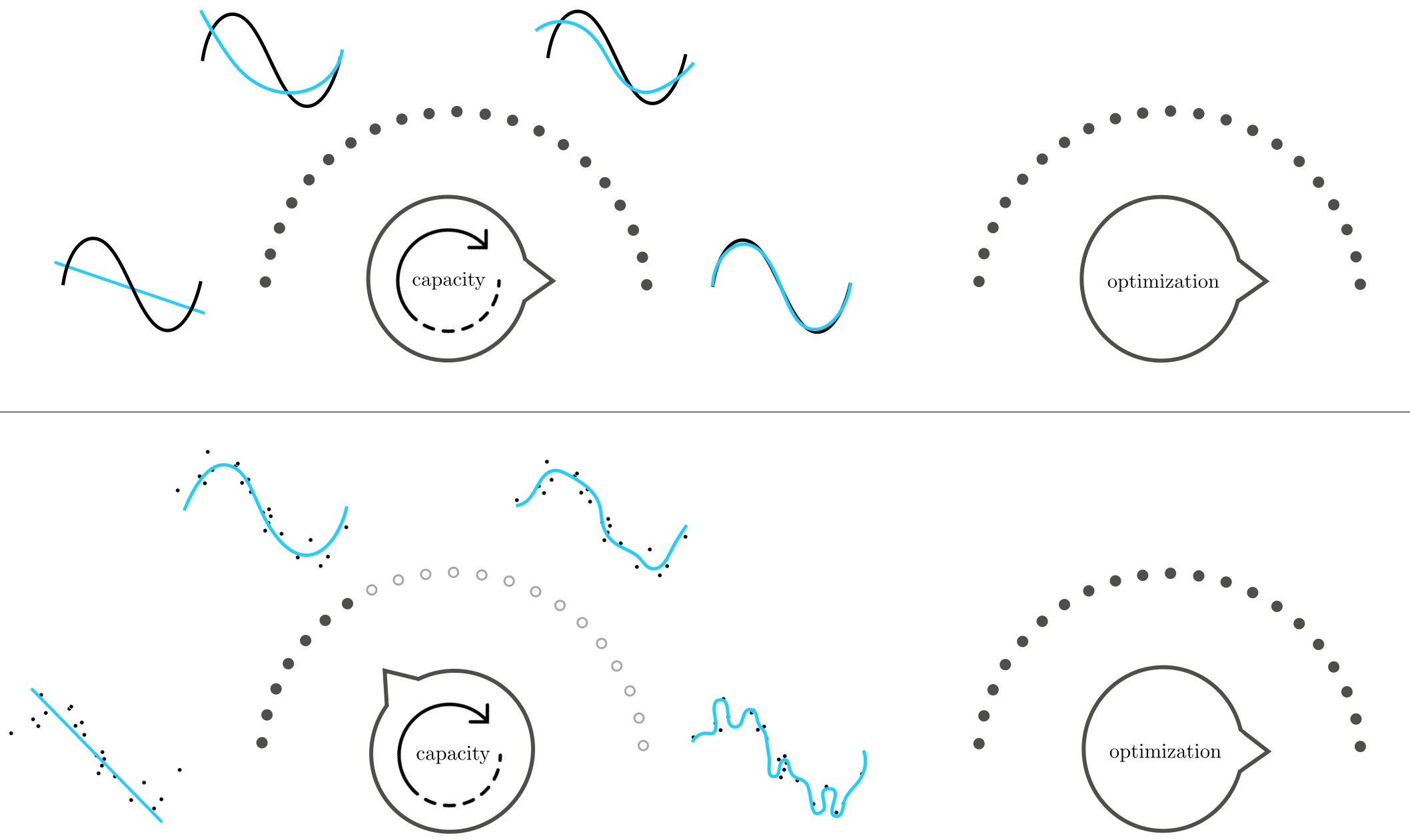
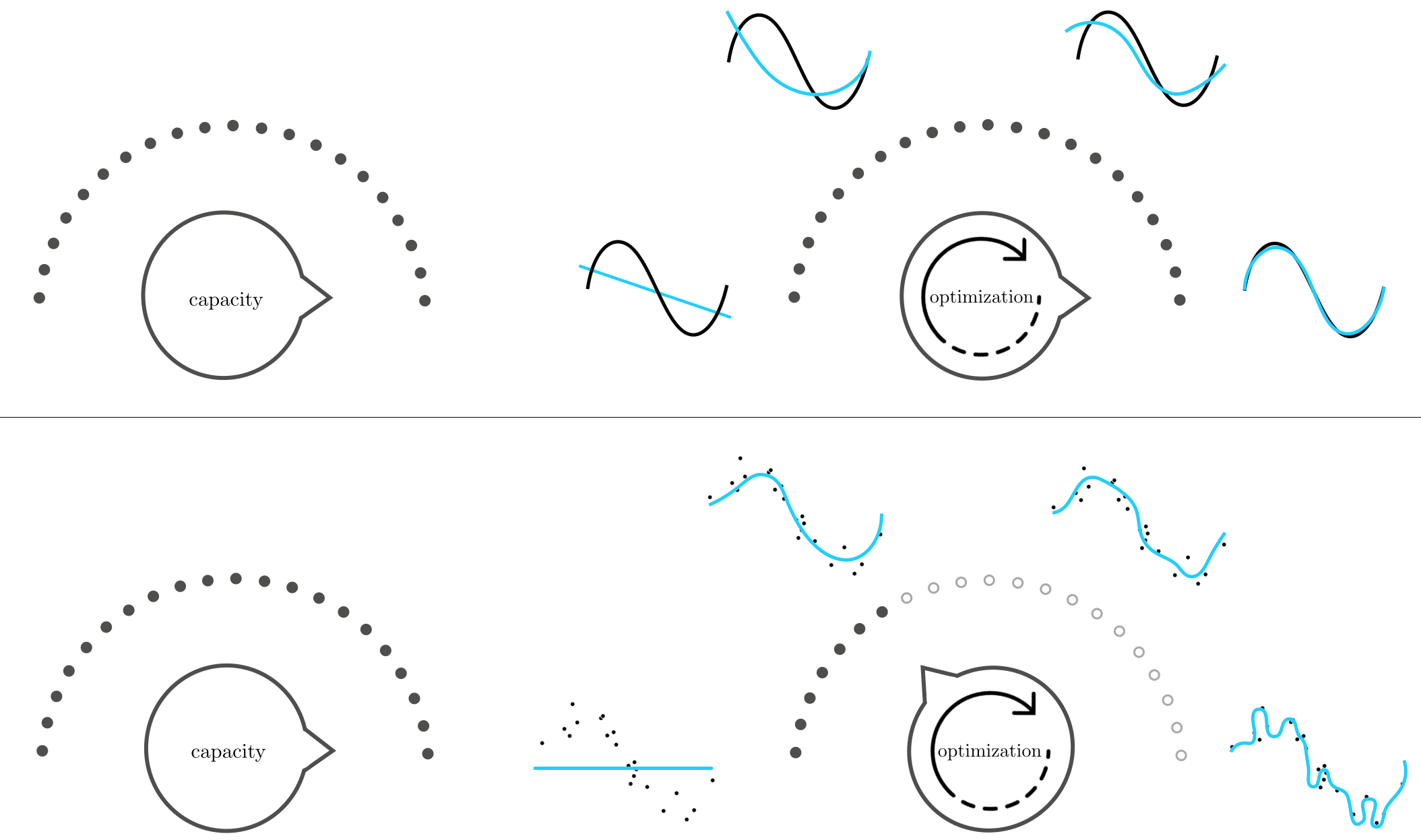
Now suppose instead that we turn our capacity dial all the way to the right, using a very high capacity model, and set its parameters by turning our optimization dial ever so slowly from left to right. In the case of perfect data, as illustrated in the top row of Figure 11.25, this approach produces tuned models that increasingly represents the data well. With real data on the other hand, as illustrated in the bottom row of Figure 11.25, starting with our optimization dial set all the way to the left will tend to produce low complexity underfitting tuned models. As we turn our optimization dial from left to right, taking steps of a particular local optimization scheme, our corresponding model will tend to increase in complexity, improving its representation of the given data. This improvement continues only up to a point where our corresponding tuned model becomes too complex for the phenomenon underlying the data, and hence overfitting begins. After this point the tuned models arising from turning the optimization dial further to the right are far too complex to adequately represent the phenomenon underlying a dataset.
How we set our capacity and optimization dials in order to achieve a final tuned model that has just the right amount of complexity for a given dataset is the main challenge we face when employing universal approximator-based models with real data. In Examples 11.7 and 11.8 we saw how training error fails to indicate when a tuned model has sufficient complexity for the tasks of regression and two-class classification respectively, a fact more generally true about all nonlinear machine learning problems as well. If we cannot rely on training error to help decide on the proper amount of complexity required to address real nonlinear machine learning tasks, what sort of measurement tool should we use instead? Closely examining Figure 11.26 reveals the answer!
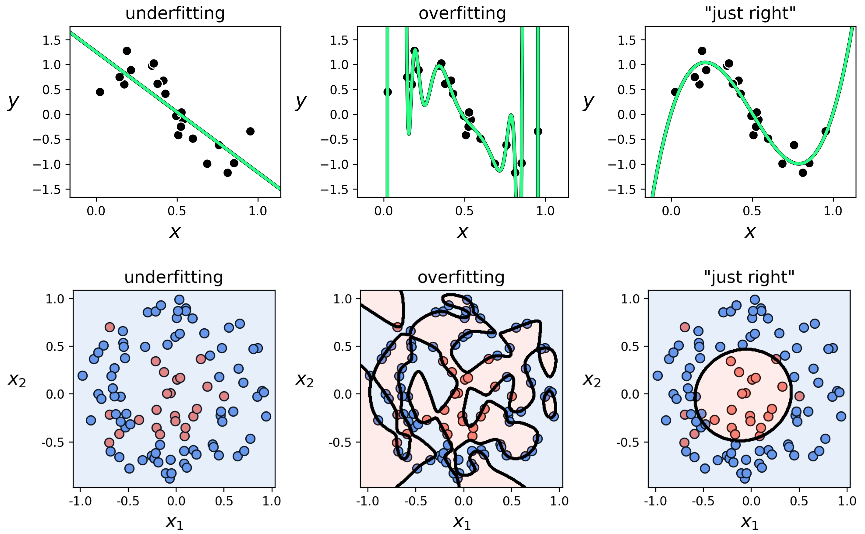
In the top row of this Figure we show three instances of models presented for the toy regression dataset in Example 11.6: a fully tuned low complexity (and underfitting) linear model in the left panel, a high complexity (and overfitting) degree $20$ polynomial model in the middle panel, and a degree $3$ polynomial model in the right panel that fits the data and the underlying phenomenon generating it "just right." What do both the underfitting and overfitting patterns have in common, that the "just right" model does not?
Scanning the left two panels of the Figure we can see that a common problem with both the underfitting and overfitting models is that, while they differ in how well they represent data we already have, they will both fail to adequately represent new data generated via the same process by which the current data was made. In other words, we would not trust either model to predict the output of a newly arrived input point. The "just right" fully tuned model does not suffer from the same problem as it closely approximates the sort of wavy sinusoidal pattern underlying the data, and as a result would work well as a predictor for future data points.
The same story tells itself in the bottom row of the Figure with our two-class classification dataset used previously in Example 11.7. Here we show a fully tuned low complexity (and underfitting) linear model in the left panel, a high complexity (and overfitting) degree $20$ polynomial model in the middle panel, and "just right" degree $2$ polynomial model in the right panel. As with the regression case, the underfitting and overfitting models both fail to adequately represent the underlying phenomenon generating our current data and, as a result, will fail to adequately predict the label values of new data generated via the same process by which the current data was made.
In summary, with both the simple regression and classification examples discussed here we can roughly qualify poorly performing models as those that will not allow us to make accurate predictions of data we will receive in the future. But how do we quantify something we will receive in the future? We address this next.
We now have an informal diagnosis for the problematic performance of underfitting/overfitting models: such models do not accurately represent new data we might receive in the future. But how can we make use of this diagnosis? We of course do not have access to any new data we will receive in the future. To make this notion useful we need to translate it into a quantity we can always measure, regardless of the dataset/problem we are tackling or the kind of model we employ.
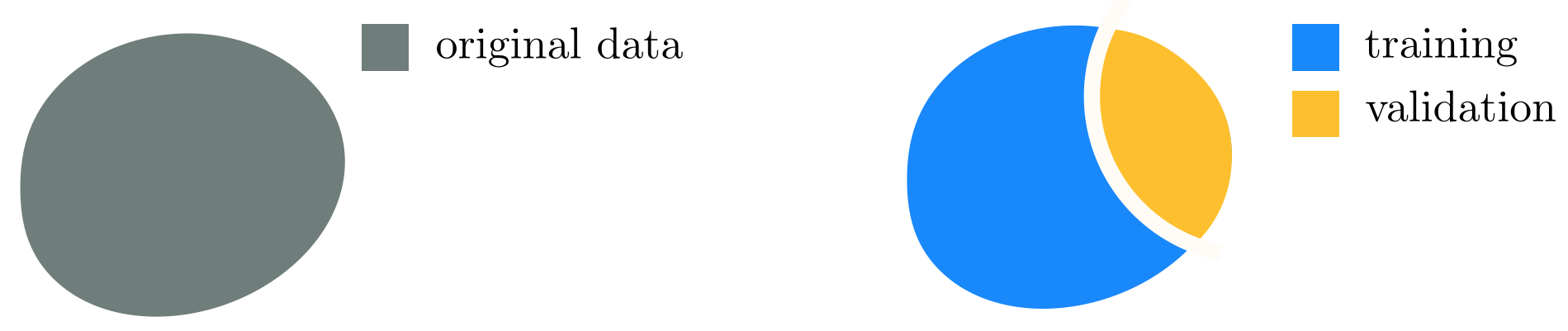
The universal way to do this is, in short, to fake it: we simply remove a random portion of our data and treat it as "new data we might receive in the future," as illustrated abstractly in Figure 11.27. In other words, we cut out a random chunk of the dataset we have, train our selection of models on only the portion of data that remains, and validate the performance of each model on this randomly removed chunk of "new" data. The random portion of the data we remove to validate our model(s) is commonly called the validation data (or validation set), and the remaining portion we use to train models is likewise referred to as the training data (or training set). The model providing the lowest error on the validation data, i.e., the lowest validation error, is then deemed the best choice from a selection of trained models. As we will see validation error (unlike training error) is in fact a proper measurement tool for determining the quality of a model against the underlying data generating phenomenon we want to capture.
There is no precise rule for what portion of a given dataset should be saved for validation. In practice, typically between $\frac{1}{10}$ to $\frac{1}{3}$ of the data is assigned to the validation set. Generally speaking, the larger and/or more representative (of the true phenomenon from which the data is sampled) a dataset is the larger the portion of the original data may be assigned to the validation set (e.g., $\frac{1}{3}$). The intuition for doing this is that if the data is plentiful/representative enough, the training set still accurately represents the underlying phenomenon even after removal of a relatively large set of validation data. Conversely, in general with smaller or less representative (i.e., more noisy or poorly distributed) datasets we usually take a smaller portion for validation (e.g., $\frac{1}{10}$) since the relatively larger training set needs to retain what little information of the underlying phenomenon was captured by the original data, and little data can be spared for validation.